Nov
16
2010

I don’t know about you, but when I am alone in my room fantasizing about babes I always imagine faceless star-shaped women with sharp points where their hands and feet should be. I’m getting hot just thinking about it now! I often have dirty thoughts about an orgy of teal and lavender pointy women all sharing my bed with me. I would run my fingers through their 3 strands of hair and caress every gentle curve of their smooth bodies. It would be a tangled pile of sex, making it impossible to tell where one body stopped and another started. Also making it impossible would be the total lack of features or genitalia on any of my boomerang-shaped lovers.
Oct
08
2010

Let’s play a game! It’s called “See if you can spot the new Gap logo.” Don’t get cocky and think it’s going to be easy, the team that did the redesign used a computer. Yeah, a computer to make a logo, can you even believe that? I did some research on AOL and I’m pretty sure they used a program called “Excel” by a computer software company called “Microsoft.” Whatever they used, the results are incredible!!!
Ready? Set? FIND THE NEW GAP LOGO!


Apr
15
2010

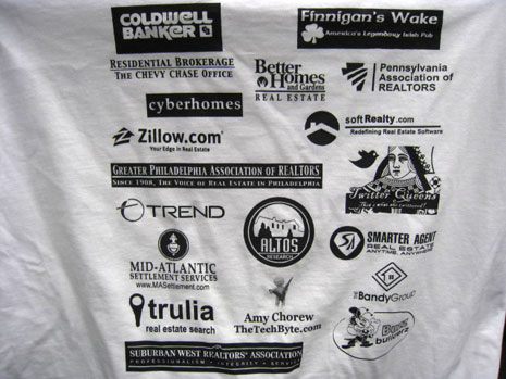
I donated $50,000 to your shitty event and all I got was this lousy T-shirt!
Think of the business that’s going to pour in from that 1/4 inch logo on the back of the T-shirt for the event you sponsored. Unless your company manufactures exercise equipment or sleeping equipment, don’t waste your time because these t-shirts will be exclusively worn at the gym or as a “sleeping shirt.”
At least with the incredible amount of white space separating each piece of art your logo will REALLY stand out! I think they should combine all the logos into one super logo that fills the entire back of the shirt. Everyone wins!
That’s all I got. There’s BBQ chicken in the next room begging to be eaten.
Jan
19
2009

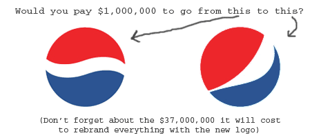
Here’s my challenge, my Pepsi challenge if you will… give me way less money, say $500,000, and I will design a new logo for Pepsi that kicks the sissy ass of this piece of shit. In fact, Pepsi could simply pay me $250,000 and I will save them about 40 million in rebranding by telling them to stick with their old/better logo. After I cash the check for $250K I would tell them their cola tastes like ass! Ass and sugar. It will be such an awesome burn because what are they gonna do, I already cashed the check (and waited for it to clear).
I will never understand why a company feels the urge to constantly spend millions and millions to simply tweak their logo in a misguided attempt to make it “hip” and “edgy.” It is extremely rare that this rebranding will end up superior to the existing identity. The only successful rebranding that comes to mind is FedEx.
These Pepsi jerks should learn a lesson from Coca-cola and 1) stay consistent and burn that logo into our minds for 100 years so we see it in our sleep and 2) make their drink taste more awesome and less like liquid balls. I realize this implies I know what balls taste like, well I do, they taste like Pepsi.


